What do video games, movies, and music CDs (feel old yet?) have in common? Besides providing hours of well-deserved entertainment, they all rely on eye-catching artwork to grab your attention. This image, called “box art,” is usually the first thing you see before you even experience the product itself. In the world of video games, we call it a video game cover.
Some games go for simple and frankly cliché yet effective designs. Think of the Persona series, where you often see a collage of cool characters on an even cooler background behind the game’s logo. Other games opt for more abstract or symbolic imagery, leaving you intrigued and wanting to learn more.
No matter the approach, a well-designed video game cover can make all the difference in attracting players and making your game stand out.
In this article, you will learn how to make a video game cover that looks amazing. We have prepared a digestible step-by-step approach to get you started as soon as possible!
How to make a video game cover?
Designing a great video game cover demands creativity and some strategy. You’ll want to capture the essence of your game while making it visually appealing to potential players. Luckily, you don’t have to be a professional designer to create a successful box art.
As for tools, many are available, from simple online editors and free options like Krita and Canva to powerful software like Photoshop. The key is understanding the principles behind good video game covers and putting in the effort to create something that represents your game well!
Before doing anything, understand your players
This is the first and most crucial step. Before you start trying compositions or choosing colors, think about your target audience. Who are you making this game for? Are they hardcore gamers who crave intense action, or are they casual players looking for a fun and relaxing experience?
Understanding your main audience helps you tailor your vision to their tastes. For instance, a dark and gritty cover will appeal to fans of horror/thriller games, but a bright and colorful cover with cute characters would be ideal for a family-friendly game.
Capture your game’s vibe
With our primer out of the way, you need to consider that every game has a unique “personality.” It could be a fast-paced action game, a whimsical adventure, a puzzle game as fiendish as BBC’s Only Connect, or anything in between. Whatever it is, its cover should reflect this personality.
You can approach this by looking at your creation’s overall mood and tone. Is it serious and intense? Lighthearted and fun? Mysterious and intriguing? Once you have a clear understanding of your game’s vibe, you can start translating those feelings into visual elements.
Find inspiration
Browse through your favorite games and see what catches your eye. Pay attention to the colors, fonts, and imagery they use. What makes them stand out? What kind of feeling do they convey?
If you’re making a sci-fi game, look at covers for other games in the same genre. See how they use futuristic elements, bold colors, and unique fonts. If your game is a fantasy RPG, explore artworks featuring epic landscapes, mythical creatures, and ornate typography.
Don’t be afraid to borrow ideas from other video game covers – gathering inspiration helps you develop your ideas and create something suitable for your game.
Compose your cover
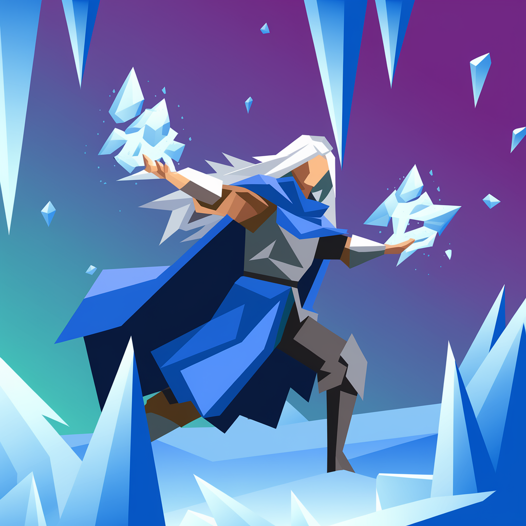
This is where things get interesting! Think about how you want to arrange the elements on your cover. This is called composition and it plays a critical role in grabbing attention and guiding the viewer’s eye.
For many gamers, your cover will be their first encounter with your game, meaning they haven’t seen any trailers or teasers on social media. And all they have is this single image to judge whether your game is worth their time and hard-earned money.
Sounds tough, right? Let’s look at some common composition tropes for video game covers:
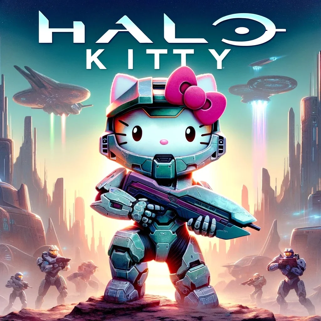
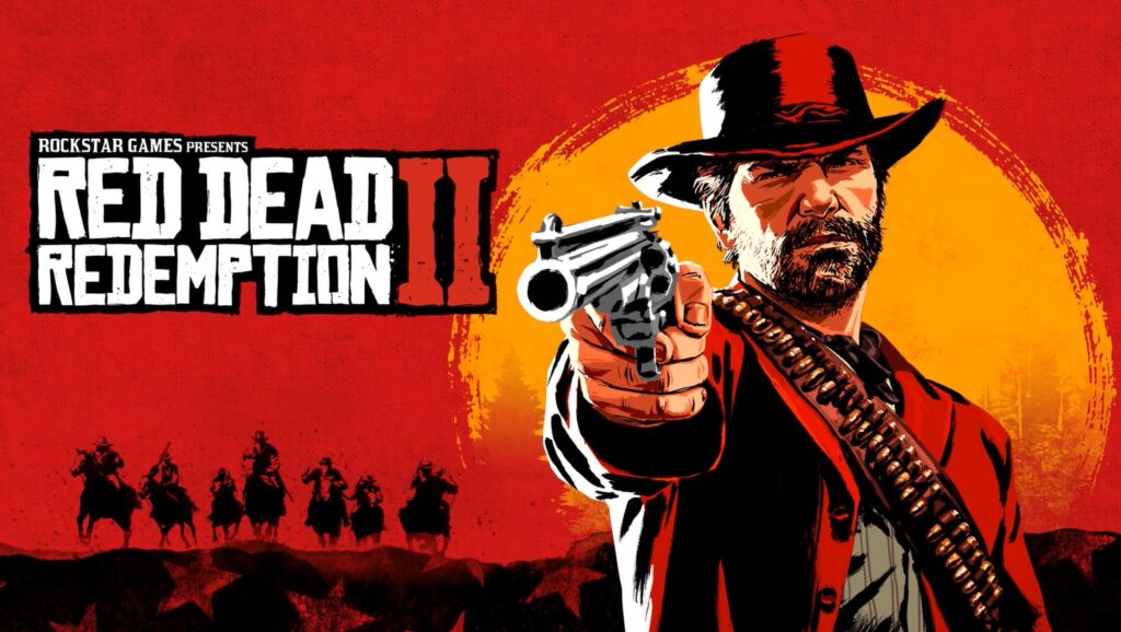
- Front-facing character: a strong, central character (usually the hero) looking directly at the viewer, which can create a fierce and engaging image;
- Back-facing character: it invites players to learn more about the game’s world by creating a sense of mystery;
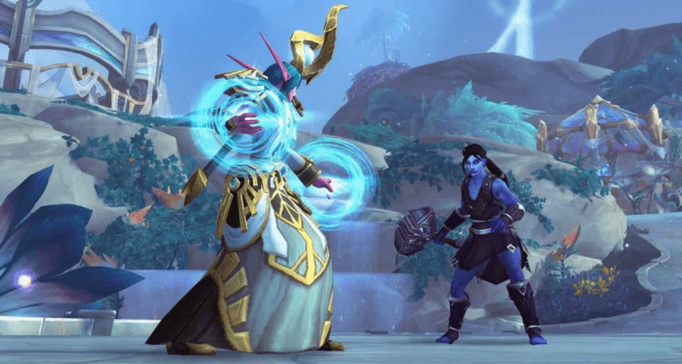
- Head-to-head: two (or more) characters facing off against each other communicates conflict and tension;
- A character with a weapon: this classic trope is effective for action games, RPGs, and some shooters, hinting at the game’s combat mechanics.
Choose your colors
Ever wondered why many fast-food joints use the classic red and yellow combo in their logos? Colors are powerful tools in design – there’s even an entire field dedicated to their study, called color psychology.
They can trigger emotions, set the mood, and communicate information quickly. For example, red usually signifies danger or excitement; blue evokes calm, trust, and melancholy; green is often associated with nature, growth, and stability.
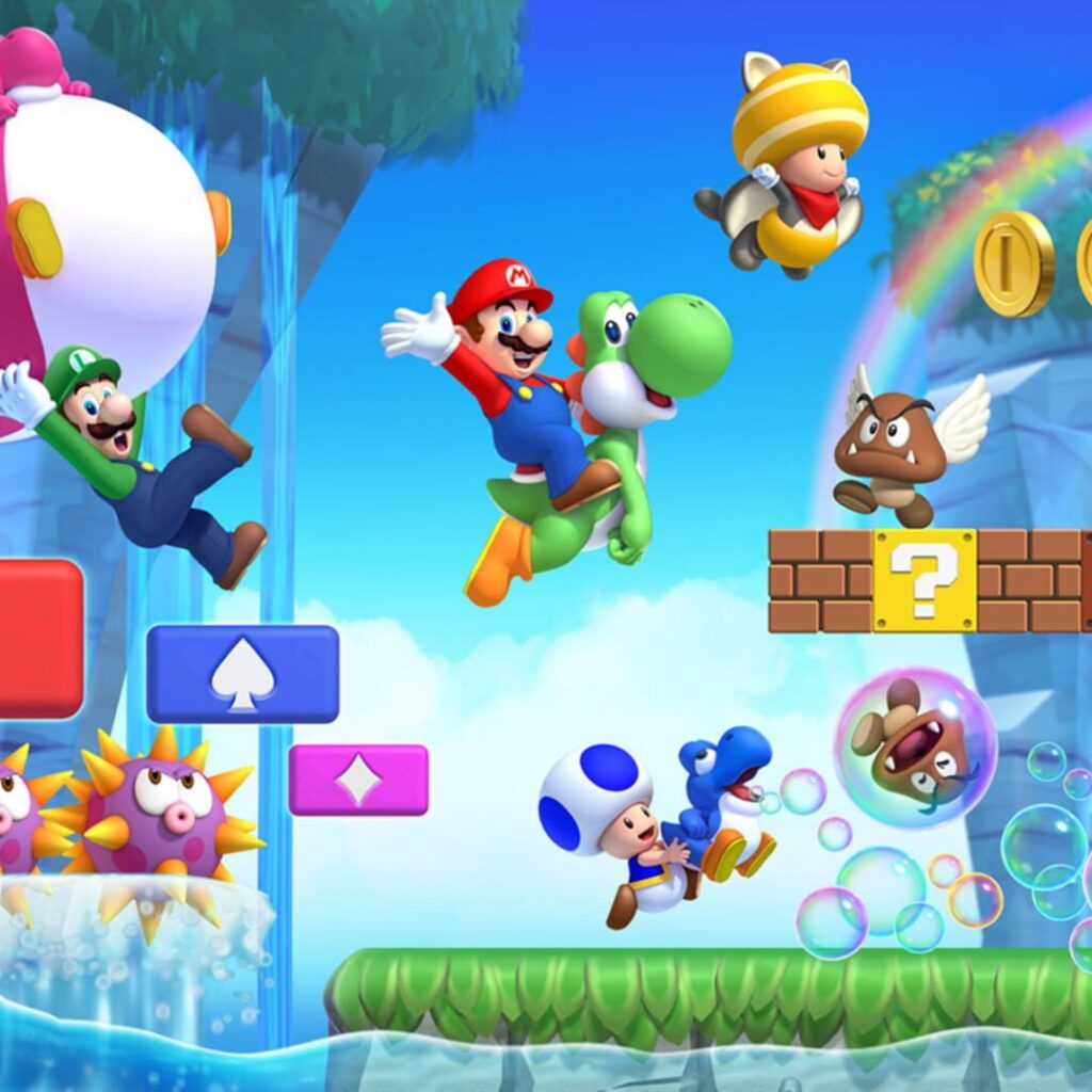
Choose a color palette that aligns with your game’s vibe. If it’s a lighthearted platformer, bright and cheerful colors will be a good fit, but games exploring somber themes will benefit more from desaturated and darker tones.
Pick the right fonts
Along with color, typography – the art of arranging type (or letters) – can say a lot about your game.
A bold, sans-serif font similar to Arial Black and Impact might fit action-packed titles, while elegant serif fonts like Times New Roman or Garamond could work well for a historical strategy game.
We’ve also seen designers use fonts resembling handwritten brushstrokes for outdoor or ancient Japan-, China-, and Korea-based games, and quirkier fonts for casual and whimsical titles.
In any case, experiment with different fonts and see what feels right for your game, but your title must remain clear, easy to read, and stand out from the background.
Showcase your game a bit
Your cover should also give players a glimpse into your game’s world – perhaps an important location, or an object central to the story.
Alternatively, instead of simply slapping your main character on the cover, try thinking about what truly sets your game apart. Is there a unique gameplay mechanic, a stunning environment, or a fantastic story element that you can visually represent? This helps your cover stand out from the crowd and pique players’ curiosity.
Get feedback!
Last, but not least, even if you think your cover is perfect, always get feedback from others. Sometimes, we get too close to our work and miss things a fresh pair of eyes would instantly spot. Ask for specific feedback on the cover’s clarity, appeal, and whether it accurately represents the game.
Use this information to refine your design and make it the best it can be. Promise?
Closing thoughts
Creating a great video game cover is like designing a window into your game’s soul. It’s a chance to show players what makes your game special, to spark their curiosity, and to draw them into the world you’ve created. It’s a challenge, but a rewarding one. With the right approach and a bit of creativity, you can design a cover that truly makes your game shine.
Need help bringing your vision to life beyond the cover? Main Leaf offers a full range of game development and outsourcing services, from 3D character modeling and animation to mobile game development and everything in between.
Whether you’re a seasoned studio looking to boost your team’s capacity or an indie developer with a dream project, we’re here to help you reach your goals. Contact us now and let’s create something amazing together!
